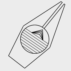
So, I have been trying out some new logo designs for my blog, and the home page. Here’s what I’ve come up with. I think I will keep this for some time, and see how it feels after a few days.
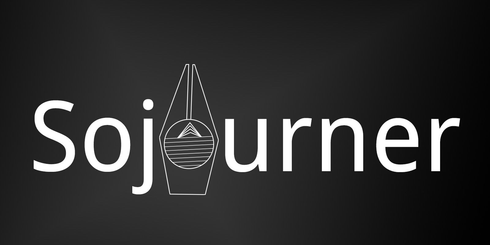
White on Black
The design of the logo is based on some thoughts, and things that I wanted to integrate within this new logo. I wasn’t too happy with the previous design (read about, and check out the previous logo design). I wanted to simplify the logo further, and add to it.
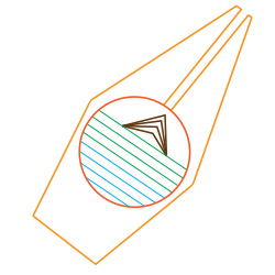
A List of Thoughts, Ideas, and Words That Inspired The Result.
The below list is what I wanted to integrate further into the logo design.
- Writing, Blogging, and Publishing.
- Simple.
- Can be drawn by hand.
- Sails.
- “Under Day” / “Under the Sun”: Roots of the word Sojourn.
- Sun, Earth, and Water.
- Compass.
- Quests, and Questions.
- Minimalistic.
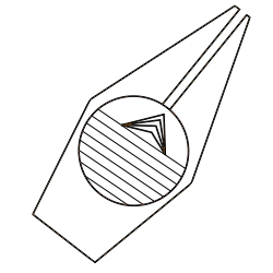
Some More Samples With Color Variations.
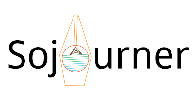
Started of as being the second 'O' of Sojourner. - Color Version.
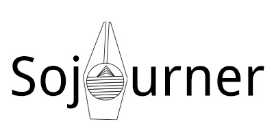
Started of as being the second 'O' of Sojourner. - Black on White Version.
Plain Logo in Color.
Plain Logo - Black on Grey.

Plain Logo - White on Black
Plain Logo - Black on White
Any critique, suggestions, and/or comments are welcome. I would love to know what you think about the design.
