When shifting over from sojourner.co to indefiniteloop.com became imminent, I started toying with the idea of having two separate logos. One for everything that was online, and the other for the papery stuff. The online version of the logo would be an animated version of a static logo design or vice-versa; that’s was the start to indefiniteloop.
I wasn’t sure which way to go. To design the static version first, keeping in mind that at a later stage it would become something animated or to design the animated one with the help of CSS3 first, and then make a static version out of whatever came out? I just ran with the later. Not worrying too much about the static version.
This is the first of a series of posts that have the code, the results, and the idea posted here, and on github.
The First Loop
Here’s The First Loop:
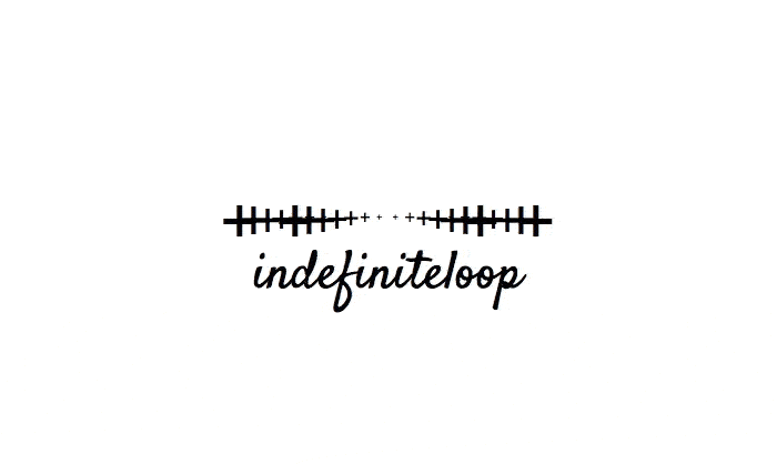
The idea was that to rotate programming language symbols. For this one, I’ve used the semicolon (:). And, this can be used with any other symbols or mixtures of some.

Colons; colons everywhere.
Here’s one with the pound sign or the hash symbol (#):
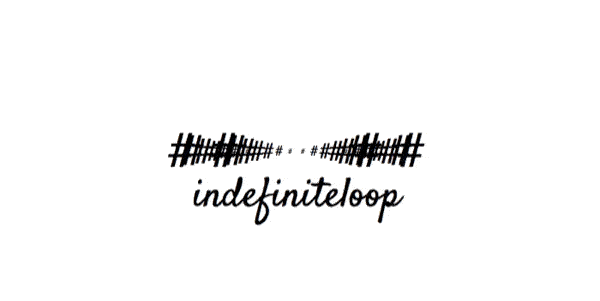
Pounds, and hash.
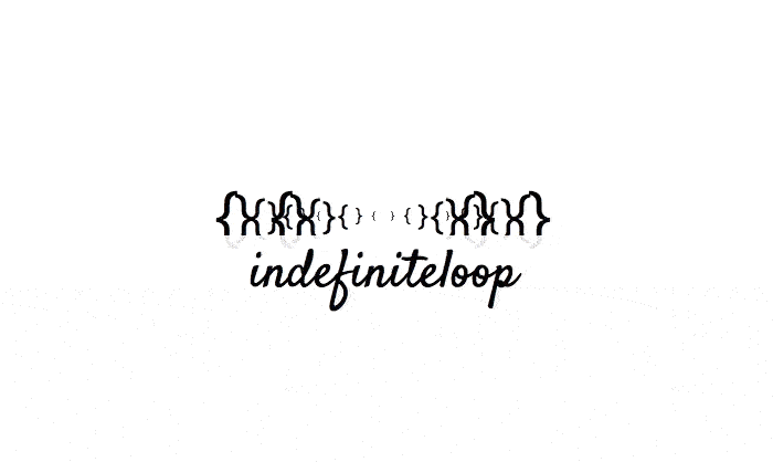
Here are the rest, the possibilities are endless:
Moe, and Larry are on vacation.
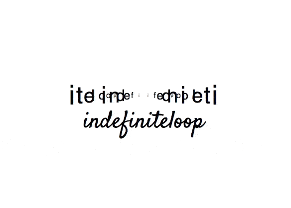
Letters, going round.
Plus, plus, plus, pulse this.
Plus, plus, plus, pulse this.

Smileys for everyone!
The First Loop: HTML5 + CSS3
<!DOCTYPE html>
<html>
<head>
<meta charset="UTF-8">
<title>Indefiniteloop.com/blog/ - Indefiniteloop + CSS3 Animation: The First Loop</title>
<style>
.holder {
width: 300px;
position: relative;
margin: 1rem auto;
margin-top: 150px;
}
.circle {
font-size: 4rem;
width: 100%;
height: 100%;
border: solid 0px;
position: absolute;
top: 0;
left: 0;
}
.circle .left {
width: 50%;
display: inline-block;
text-align: left;
}
.circle .right {
width: 50%;
display: inline-block;
text-align: right;
}
.circle:nth-child(1) {
width: 200px;
height: 200px;
top: -68px;
left: 50%;
margin-left: -100px;
line-height: 200px;
font-size: 3.5rem;
-webkit-animation: circle-1 10s infinite ease-in-out;
animation: circle-1 10s infinite ease-in-out;
-webkit-animation-delay: 1s;
/* Chrome, Safari, Opera */
animation-delay: 1s;
}
@-webkit-keyframes circle-1 {
0% {
-webkit-transform: rotate(0deg);
transform: rotate(0deg);
}
100% {
-webkit-transform: rotate(360deg);
transform: rotate(360deg);
}
}
@keyframes circle-1 {
0% {
-webkit-transform: rotate(0deg);
transform: rotate(0deg);
}
100% {
-webkit-transform: rotate(360deg);
transform: rotate(360deg);
}
}
.circle:nth-child(2) {
width: 170px;
height: 170px;
top: -53px;
left: 50%;
margin-left: -85px;
line-height: 170px;
font-size: 3rem;
-webkit-animation: circle-2 10s infinite ease-in-out;
animation: circle-2 10s infinite ease-in-out;
-webkit-animation-delay: 1s;
/* Chrome, Safari, Opera */
animation-delay: 1s;
}
@-webkit-keyframes circle-2 {
0% {
-webkit-transform: rotate(0deg);
transform: rotate(0deg);
}
100% {
-webkit-transform: rotate(-720deg);
transform: rotate(-720deg);
}
}
@keyframes circle-2 {
0% {
-webkit-transform: rotate(0deg);
transform: rotate(0deg);
}
100% {
-webkit-transform: rotate(-720deg);
transform: rotate(-720deg);
}
}
.circle:nth-child(3) {
width: 140px;
height: 140px;
top: -38px;
left: 50%;
margin-left: -70px;
line-height: 140px;
font-size: 2.5rem;
-webkit-animation: circle-3 10s infinite ease-in-out;
animation: circle-3 10s infinite ease-in-out;
-webkit-animation-delay: 1s;
/* Chrome, Safari, Opera */
animation-delay: 1s;
}
@-webkit-keyframes circle-3 {
0% {
-webkit-transform: rotate(0deg);
transform: rotate(0deg);
}
100% {
-webkit-transform: rotate(1080deg);
transform: rotate(1080deg);
}
}
@keyframes circle-3 {
0% {
-webkit-transform: rotate(0deg);
transform: rotate(0deg);
}
100% {
-webkit-transform: rotate(1080deg);
transform: rotate(1080deg);
}
}
.circle:nth-child(4) {
width: 110px;
height: 110px;
top: -23px;
left: 50%;
margin-left: -55px;
line-height: 110px;
font-size: 2rem;
-webkit-animation: circle-4 10s infinite ease-in-out;
animation: circle-4 10s infinite ease-in-out;
-webkit-animation-delay: 1s;
/* Chrome, Safari, Opera */
animation-delay: 1s;
}
@-webkit-keyframes circle-4 {
0% {
-webkit-transform: rotate(0deg);
transform: rotate(0deg);
}
100% {
-webkit-transform: rotate(-1440deg);
transform: rotate(-1440deg);
}
}
@keyframes circle-4 {
0% {
-webkit-transform: rotate(0deg);
transform: rotate(0deg);
}
100% {
-webkit-transform: rotate(-1440deg);
transform: rotate(-1440deg);
}
}
.circle:nth-child(5) {
width: 80px;
height: 80px;
top: -8px;
left: 50%;
margin-left: -40px;
line-height: 80px;
font-size: 1.5rem;
-webkit-animation: circle-5 10s infinite ease-in-out;
animation: circle-5 10s infinite ease-in-out;
-webkit-animation-delay: 1s;
/* Chrome, Safari, Opera */
animation-delay: 1s;
}
@-webkit-keyframes circle-5 {
0% {
-webkit-transform: rotate(0deg);
transform: rotate(0deg);
}
100% {
-webkit-transform: rotate(1800deg);
transform: rotate(1800deg);
}
}
@keyframes circle-5 {
0% {
-webkit-transform: rotate(0deg);
transform: rotate(0deg);
}
100% {
-webkit-transform: rotate(1800deg);
transform: rotate(1800deg);
}
}
.circle:nth-child(6) {
width: 50px;
height: 50px;
top: 7px;
left: 50%;
margin-left: -25px;
line-height: 50px;
font-size: 1rem;
-webkit-animation: circle-6 10s infinite ease-in-out;
animation: circle-6 10s infinite ease-in-out;
-webkit-animation-delay: 1s;
/* Chrome, Safari, Opera */
animation-delay: 1s;
}
@-webkit-keyframes circle-6 {
0% {
-webkit-transform: rotate(0deg);
transform: rotate(0deg);
}
100% {
-webkit-transform: rotate(-2160deg);
transform: rotate(-2160deg);
}
}
@keyframes circle-6 {
0% {
-webkit-transform: rotate(0deg);
transform: rotate(0deg);
}
100% {
-webkit-transform: rotate(-2160deg);
transform: rotate(-2160deg);
}
}
.circle:nth-child(7) {
width: 20px;
height: 20px;
top: 22px;
left: 50%;
margin-left: -10px;
line-height: 20px;
font-size: 0.5rem;
-webkit-animation: circle-7 10s infinite ease-in-out;
animation: circle-7 10s infinite ease-in-out;
-webkit-animation-delay: 1s;
/* Chrome, Safari, Opera */
animation-delay: 1s;
}
@-webkit-keyframes circle-7 {
0% {
-webkit-transform: rotate(0deg);
transform: rotate(0deg);
}
100% {
-webkit-transform: rotate(2520deg);
transform: rotate(2520deg);
}
}
@keyframes circle-7 {
0% {
-webkit-transform: rotate(0deg);
transform: rotate(0deg);
}
100% {
-webkit-transform: rotate(2520deg);
transform: rotate(2520deg);
}
}
.circle:nth-child(8) {
width: -10px;
height: -10px;
top: 37px;
left: 50%;
margin-left: 5px;
line-height: -10px;
font-size: 0rem;
-webkit-animation: circle-8 10s infinite ease-in-out;
animation: circle-8 10s infinite ease-in-out;
-webkit-animation-delay: 1s;
/* Chrome, Safari, Opera */
animation-delay: 1s;
}
@-webkit-keyframes circle-8 {
0% {
-webkit-transform: rotate(0deg);
transform: rotate(0deg);
}
100% {
-webkit-transform: rotate(-2880deg);
transform: rotate(-2880deg);
}
}
@keyframes circle-8 {
0% {
-webkit-transform: rotate(0deg);
transform: rotate(0deg);
}
100% {
-webkit-transform: rotate(-2880deg);
transform: rotate(-2880deg);
}
}
.circle:nth-child(9) {
width: 300px;
height: 300px;
top: -118px;
left: 50%;
margin-left: -150px;
line-height: 300px;
font-size: 3.5rem;
-webkit-animation: circle-9 10s infinite ease-in-out;
animation: circle-9 10s infinite ease-in-out;
-webkit-animation-delay: 1s;
/* Chrome, Safari, Opera */
animation-delay: 1s;
}
@-webkit-keyframes circle-9 {
0% {
-webkit-transform: rotate(0deg);
transform: rotate(0deg);
}
100% {
-webkit-transform: rotate(3240deg);
transform: rotate(3240deg);
}
}
@keyframes circle-9 {
0% {
-webkit-transform: rotate(0deg);
transform: rotate(0deg);
}
100% {
-webkit-transform: rotate(3240deg);
transform: rotate(3240deg);
}
}
.circle:nth-child(10) {
width: 270px;
height: 270px;
top: -103px;
left: 50%;
margin-left: -135px;
line-height: 270px;
font-size: 3rem;
-webkit-animation: circle-10 10s infinite ease-in-out;
animation: circle-10 10s infinite ease-in-out;
-webkit-animation-delay: 1s;
/* Chrome, Safari, Opera */
animation-delay: 1s;
}
@-webkit-keyframes circle-10 {
0% {
-webkit-transform: rotate(0deg);
transform: rotate(0deg);
}
100% {
-webkit-transform: rotate(-3600deg);
transform: rotate(-3600deg);
}
}
@keyframes circle-10 {
0% {
-webkit-transform: rotate(0deg);
transform: rotate(0deg);
}
100% {
-webkit-transform: rotate(-3600deg);
transform: rotate(-3600deg);
}
}
.circle:nth-child(11) {
width: 240px;
height: 240px;
top: -88px;
left: 50%;
margin-left: -120px;
line-height: 240px;
font-size: 2.5rem;
-webkit-animation: circle-11 10s infinite ease-in-out;
animation: circle-11 10s infinite ease-in-out;
-webkit-animation-delay: 1s;
/* Chrome, Safari, Opera */
animation-delay: 1s;
}
@-webkit-keyframes circle-11 {
0% {
-webkit-transform: rotate(0deg);
transform: rotate(0deg);
}
100% {
-webkit-transform: rotate(3960deg);
transform: rotate(3960deg);
}
}
@keyframes circle-11 {
0% {
-webkit-transform: rotate(0deg);
transform: rotate(0deg);
}
100% {
-webkit-transform: rotate(3960deg);
transform: rotate(3960deg);
}
}
.circle:nth-child(12) {
width: 210px;
height: 210px;
top: -73px;
left: 50%;
margin-left: -105px;
line-height: 210px;
font-size: 2rem;
-webkit-animation: circle-12 10s infinite ease-in-out;
animation: circle-12 10s infinite ease-in-out;
-webkit-animation-delay: 1s;
/* Chrome, Safari, Opera */
animation-delay: 1s;
}
@-webkit-keyframes circle-12 {
0% {
-webkit-transform: rotate(0deg);
transform: rotate(0deg);
}
100% {
-webkit-transform: rotate(-4320deg);
transform: rotate(-4320deg);
}
}
@keyframes circle-12 {
0% {
-webkit-transform: rotate(0deg);
transform: rotate(0deg);
}
100% {
-webkit-transform: rotate(-4320deg);
transform: rotate(-4320deg);
}
}
.circle:nth-child(13) {
width: 180px;
height: 180px;
top: -58px;
left: 50%;
margin-left: -90px;
line-height: 180px;
font-size: 1.5rem;
-webkit-animation: circle-13 10s infinite ease-in-out;
animation: circle-13 10s infinite ease-in-out;
-webkit-animation-delay: 1s;
/* Chrome, Safari, Opera */
animation-delay: 1s;
}
@-webkit-keyframes circle-13 {
0% {
-webkit-transform: rotate(0deg);
transform: rotate(0deg);
}
100% {
-webkit-transform: rotate(4680deg);
transform: rotate(4680deg);
}
}
@keyframes circle-13 {
0% {
-webkit-transform: rotate(0deg);
transform: rotate(0deg);
}
100% {
-webkit-transform: rotate(4680deg);
transform: rotate(4680deg);
}
}
.circle:nth-child(14) {
width: 150px;
height: 150px;
top: -43px;
left: 50%;
margin-left: -75px;
line-height: 150px;
font-size: 1rem;
-webkit-animation: circle-14 10s infinite ease-in-out;
animation: circle-14 10s infinite ease-in-out;
-webkit-animation-delay: 1s;
/* Chrome, Safari, Opera */
animation-delay: 1s;
}
@-webkit-keyframes circle-14 {
0% {
-webkit-transform: rotate(0deg);
transform: rotate(0deg);
}
100% {
-webkit-transform: rotate(-5040deg);
transform: rotate(-5040deg);
}
}
@keyframes circle-14 {
0% {
-webkit-transform: rotate(0deg);
transform: rotate(0deg);
}
100% {
-webkit-transform: rotate(-5040deg);
transform: rotate(-5040deg);
}
}
.circle:nth-child(15) {
width: 120px;
height: 120px;
top: -28px;
left: 50%;
margin-left: -60px;
line-height: 120px;
font-size: 0.5rem;
-webkit-animation: circle-15 10s infinite ease-in-out;
animation: circle-15 10s infinite ease-in-out;
-webkit-animation-delay: 1s;
/* Chrome, Safari, Opera */
animation-delay: 1s;
}
@-webkit-keyframes circle-15 {
0% {
-webkit-transform: rotate(0deg);
transform: rotate(0deg);
}
100% {
-webkit-transform: rotate(5400deg);
transform: rotate(5400deg);
}
}
@keyframes circle-15 {
0% {
-webkit-transform: rotate(0deg);
transform: rotate(0deg);
}
100% {
-webkit-transform: rotate(5400deg);
transform: rotate(5400deg);
}
}
.circle:nth-child(16) {
width: 90px;
height: 90px;
top: -13px;
left: 50%;
margin-left: -45px;
line-height: 90px;
font-size: 0rem;
-webkit-animation: circle-16 10s infinite ease-in-out;
animation: circle-16 10s infinite ease-in-out;
-webkit-animation-delay: 1s;
/* Chrome, Safari, Opera */
animation-delay: 1s;
}
@-webkit-keyframes circle-16 {
0% {
-webkit-transform: rotate(0deg);
transform: rotate(0deg);
}
100% {
-webkit-transform: rotate(-5760deg);
transform: rotate(-5760deg);
}
}
@keyframes circle-16 {
0% {
-webkit-transform: rotate(0deg);
transform: rotate(0deg);
}
100% {
-webkit-transform: rotate(-5760deg);
transform: rotate(-5760deg);
}
}
.logo {
width: 300px;
height: 70px;
position: relative;
margin: 0 auto;
font-family: 'satisfy';
/*'The Girl Next Door', cursive;*/
text-align: center;
font-size: 3rem;
color: #000;
top: 50px;
border: 1px solid transparent;
opacity: 1;
background-color: rgba(255, 255, 255, 0.9);
}
</style>
</head>
<body>
<br/><br/><br/>
<div class="holder">
<div class="circle"><span class="left">:</span><span class="right">:</span></div>
<div class="circle"><span class="left">:</span><span class="right">:</span></div>
<div class="circle"><span class="left">:</span><span class="right">:</span></div>
<div class="circle"><span class="left">:</span><span class="right">:</span></div>
<div class="circle"><span class="left">:</span><span class="right">:</span></div>
<div class="circle"><span class="left">:</span><span class="right">:</span></div>
<div class="circle"><span class="left">:</span><span class="right">:</span></div>
<div class="circle"><span class="left">:</span><span class="right">:</span></div>
<div class="circle"><span class="left">:</span><span class="right">:</span></div>
<div class="circle"><span class="left">:</span><span class="right">:</span></div>
<div class="circle"><span class="left">:</span><span class="right">:</span></div>
<div class="circle"><span class="left">:</span><span class="right">:</span></div>
<div class="circle"><span class="left">:</span><span class="right">:</span></div>
<div class="circle"><span class="left">:</span><span class="right">:</span></div>
<div class="circle"><span class="left">:</span><span class="right">:</span></div>
<div class="circle"><span class="left">:</span><span class="right">:</span></div>
<div class="logo">indefiniteloop</div>
</div>
</body>
</html>It’s really simple to follow, and purely done up in HTML5/CSS3. You can download the source code here.
