In yesterday’s post I wrote about the current theme design, and the style book/guide. When the logo that I had previously chosen as a mark of this new site/blog/brand was added into this style book that I unintentionally recreated, it felt as if it was at odds with the whole minimalism of the new design. I felt the need to shed some weight off of this logo too.
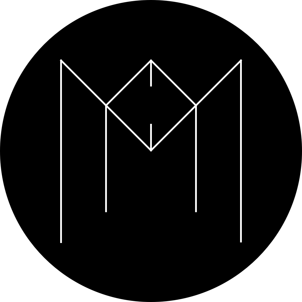
I kept looking at logo designs, from all over the Internet. Most of them were breath taking-ly beautiful, and meaningful. I felt the need to be more open with whatever the new logo would be. I knew I wanted to shed some weight off of it, make it lighter, minimal, easy to remember, and easy to draw. I wanted this new mark to become a representative of a couple of concepts, and my identity - indefiniteloop, Manoj, a pen, and a pencil. It did take me some time getting it right, but here it is - the new logo/branding of indefiniteloop.
The All Crisp & New Indefiniteloop Logo.
I love the thin lines, and the use of whitespace. The logo does hold meaning, and I find it beautiful.

New logo for indefiniteloop.com
Let Me Know What You Think, About This New Logo?
Do let me know what you guys think of it! Would love some critique too.
